01 · The Gap
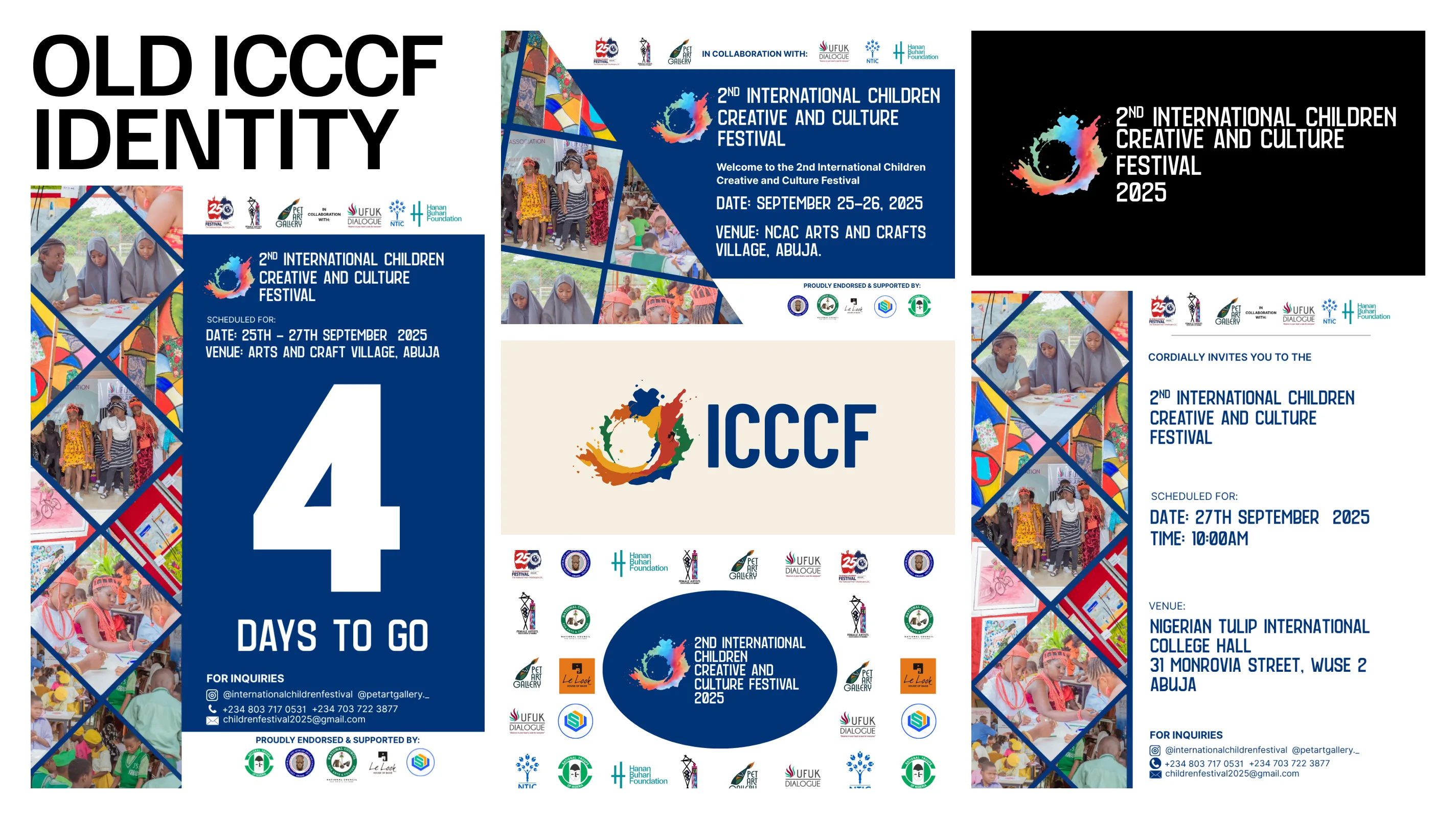
ICCCF grew out of sixteen years of work to put Nigerian children on a real stage, from the first Art Olympiad in 2010 to a festival that now runs five competitions over three days. Its identity had not kept up. Each piece of the second edition carried its own mix of logos, photos, and patterns, and the mark said little about what happens at the festival. That matters when parents and schools are deciding whether to trust an event with their children.
02 · The Idea
Parents and educators rarely doubt their child's talent. What they lack is a credible stage for it. We built the strategy on that insight and on one belief: creativity is development, not decoration. The promise became an operating rule. Every child creates, competes, or performs, and every child is acknowledged. The brand idea, Seen and Soaring, is what that recognition releases in a child. The festival's own line, One World, Many Colours, gave the identity its brief.
03 · The Mark
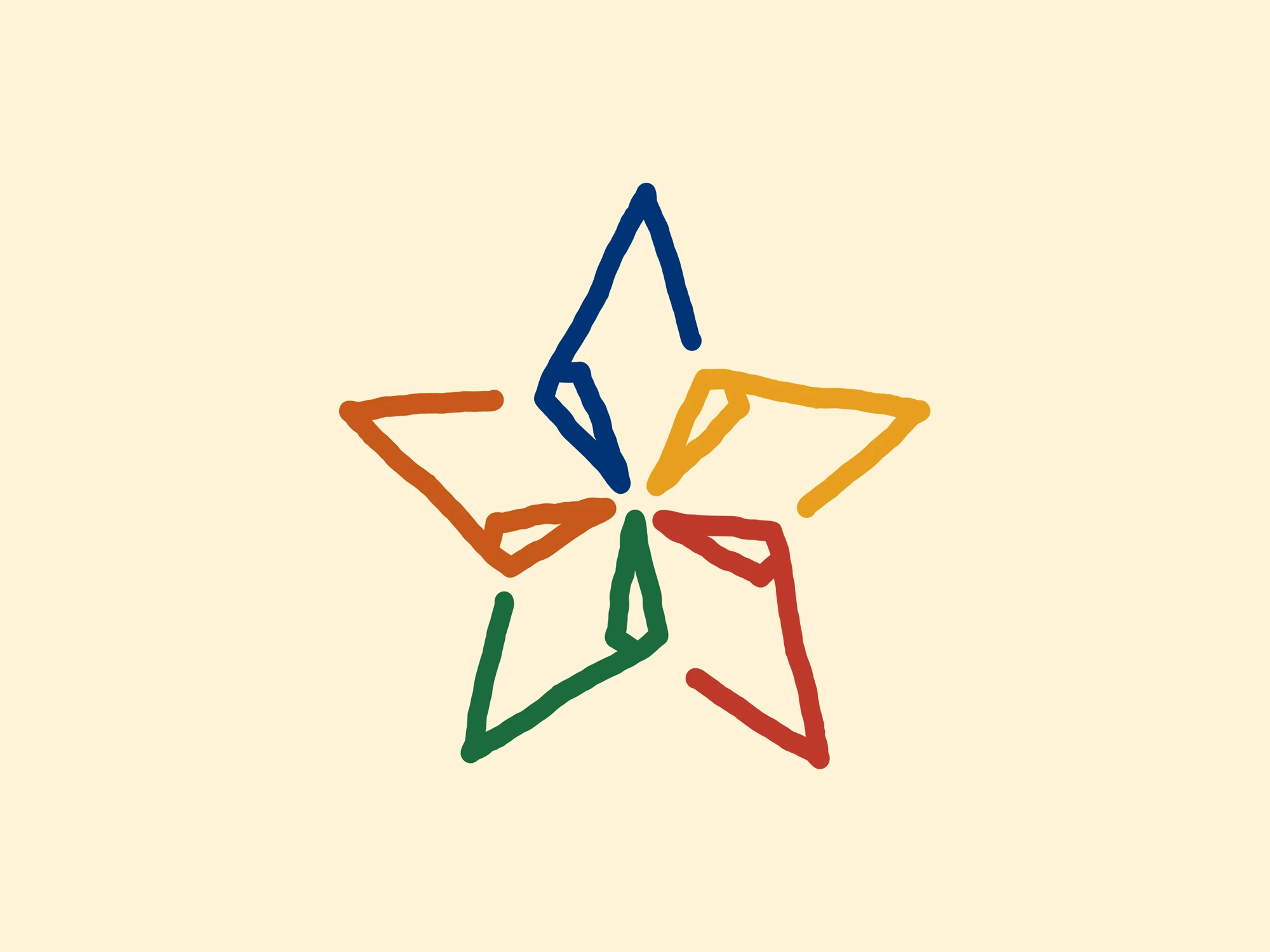
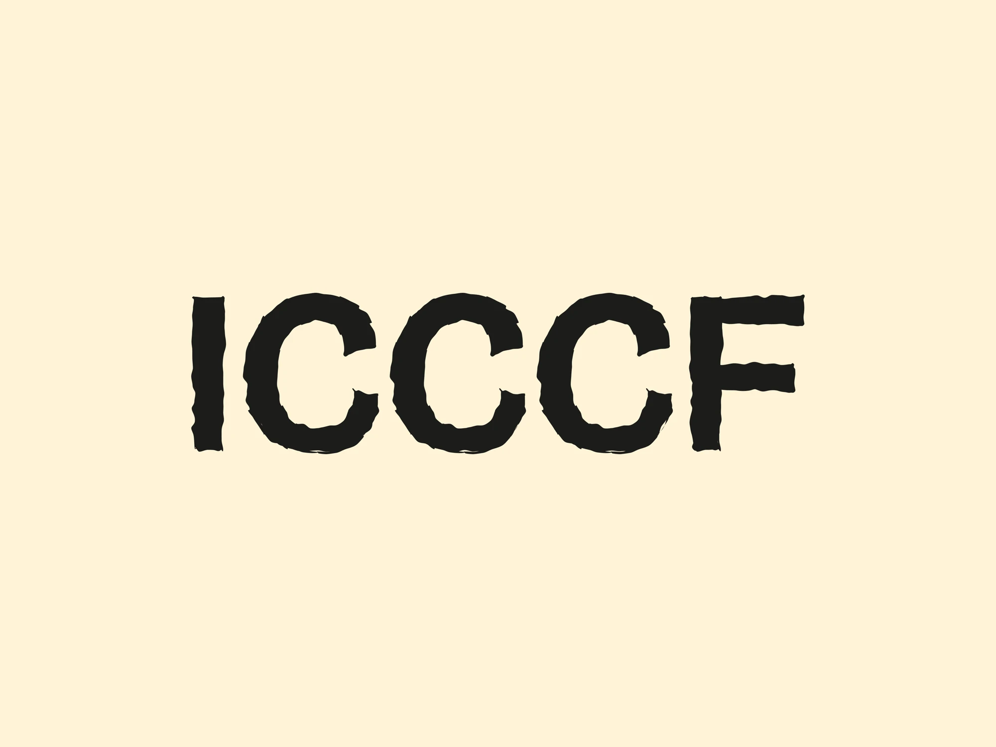
The logomark is a five-armed star drawn in five separate strokes, one for each competition: navy for Cultural Performances, gold for Drawing & Painting, terracotta for Indigenous Fashion Show, green for Mother Language, and red for Spelling Bee. The strokes converge on a shared centre, so the mark reads as one form made of five distinct voices. They don't join perfectly, and that is deliberate. A mark drawn with the loose confidence of a child's hand says more about children's creativity than a precisely constructed symbol could. The client asked for the name to be as artistic as the symbol, so the wordmark is hand-drawn too. It carries no edition number: the logo belongs to the whole festival, and the number appears only on event materials.
04 · Colour & Type
Every colour has a job. The five strokes give the palette Regal Navy, Golden Orange, Bronze Spice, Dark Emerald, and Tomato Jam. Navy doubles as the permanent anchor, so the festival stays recognisable from edition to edition. Old Lace gives formal pieces the feel of paper and handmade craft, and Carbon Black keeps text soft rather than clinical. Everything outside the wordmark is set in Familjen Grotesk, one family quiet enough to let the wordmark speak and sturdy enough to hold a six-metre backdrop. It is also the website's typeface, so the festival speaks with one voice across print and screen.
05 · The Pattern
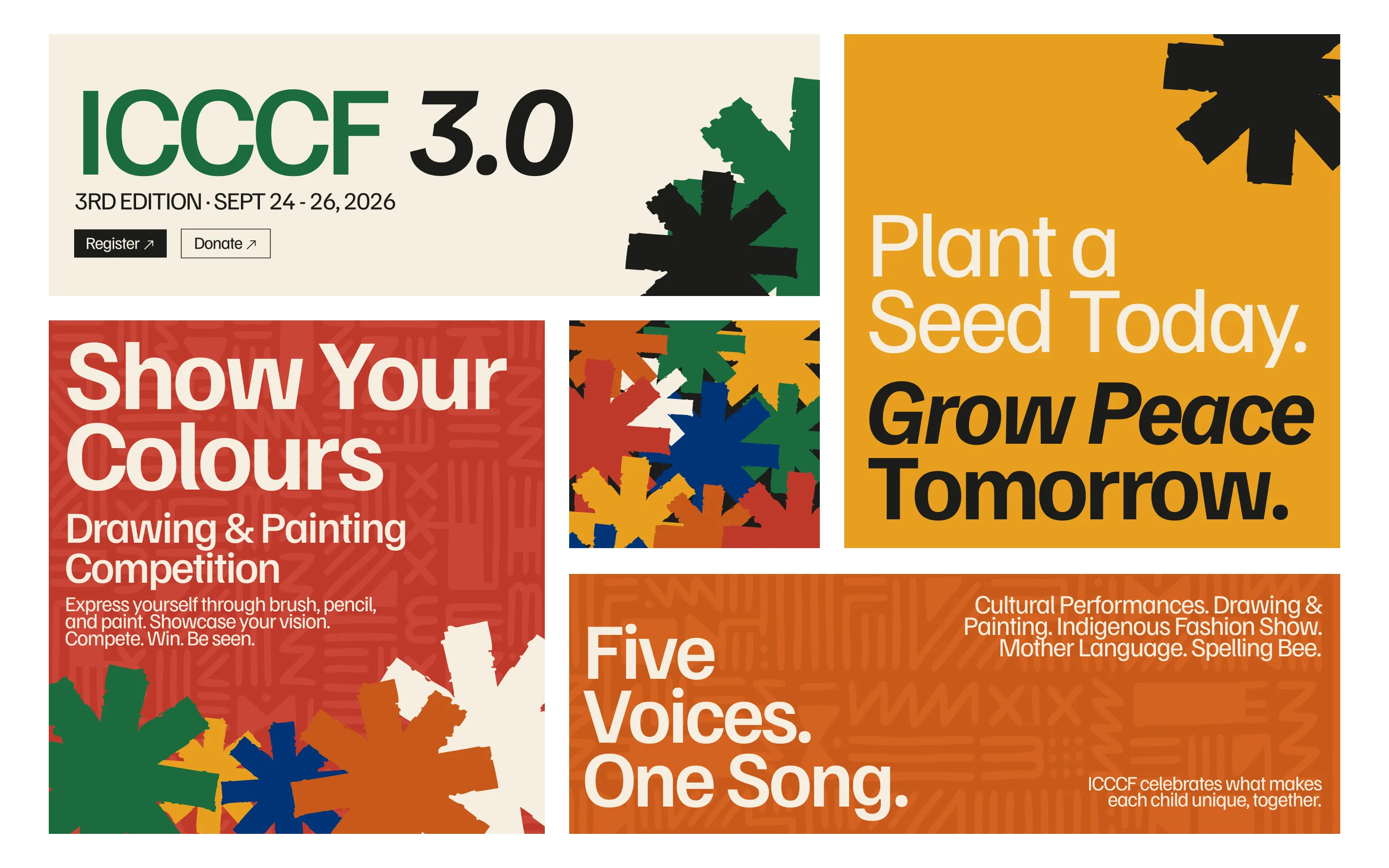
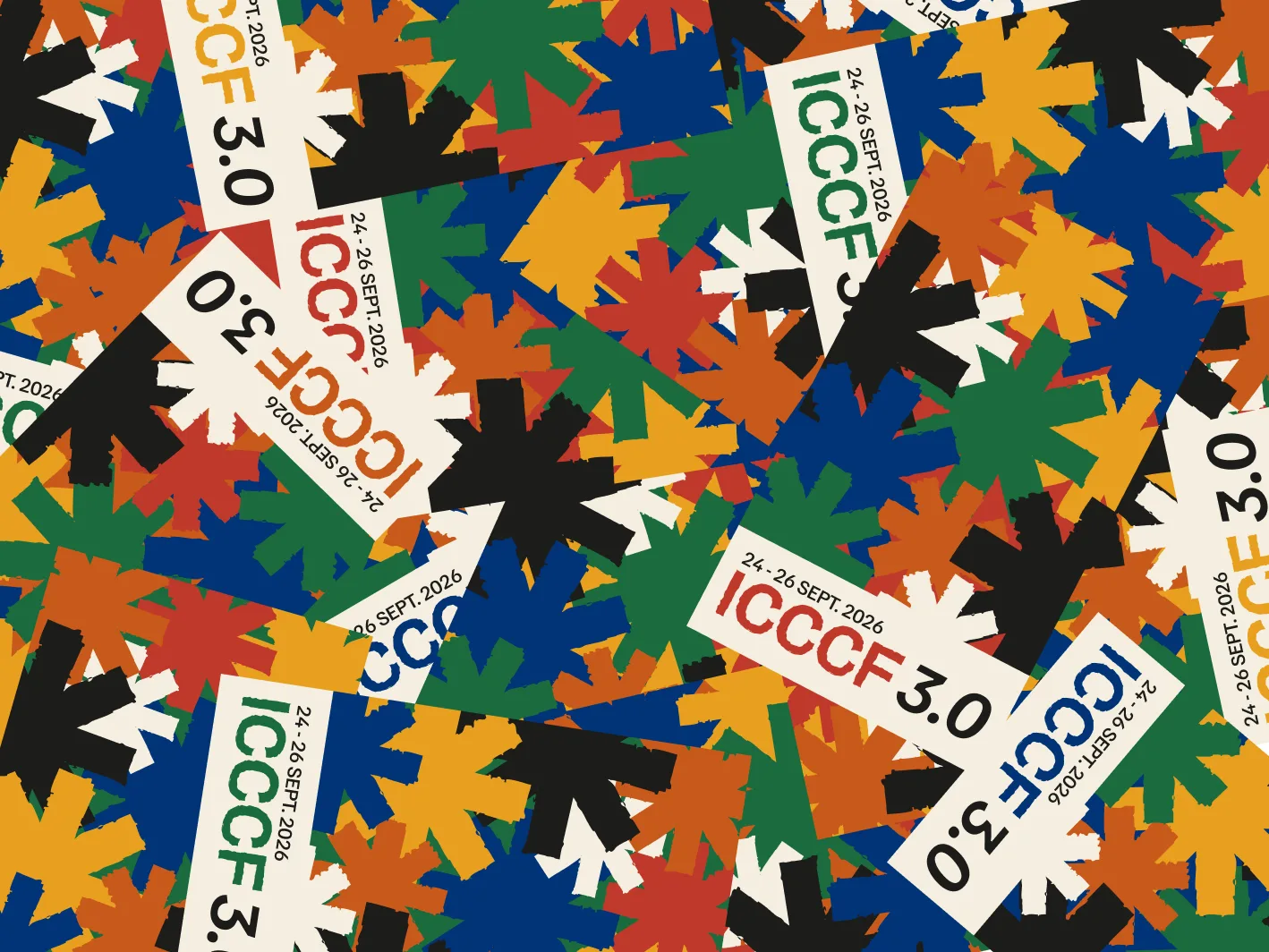
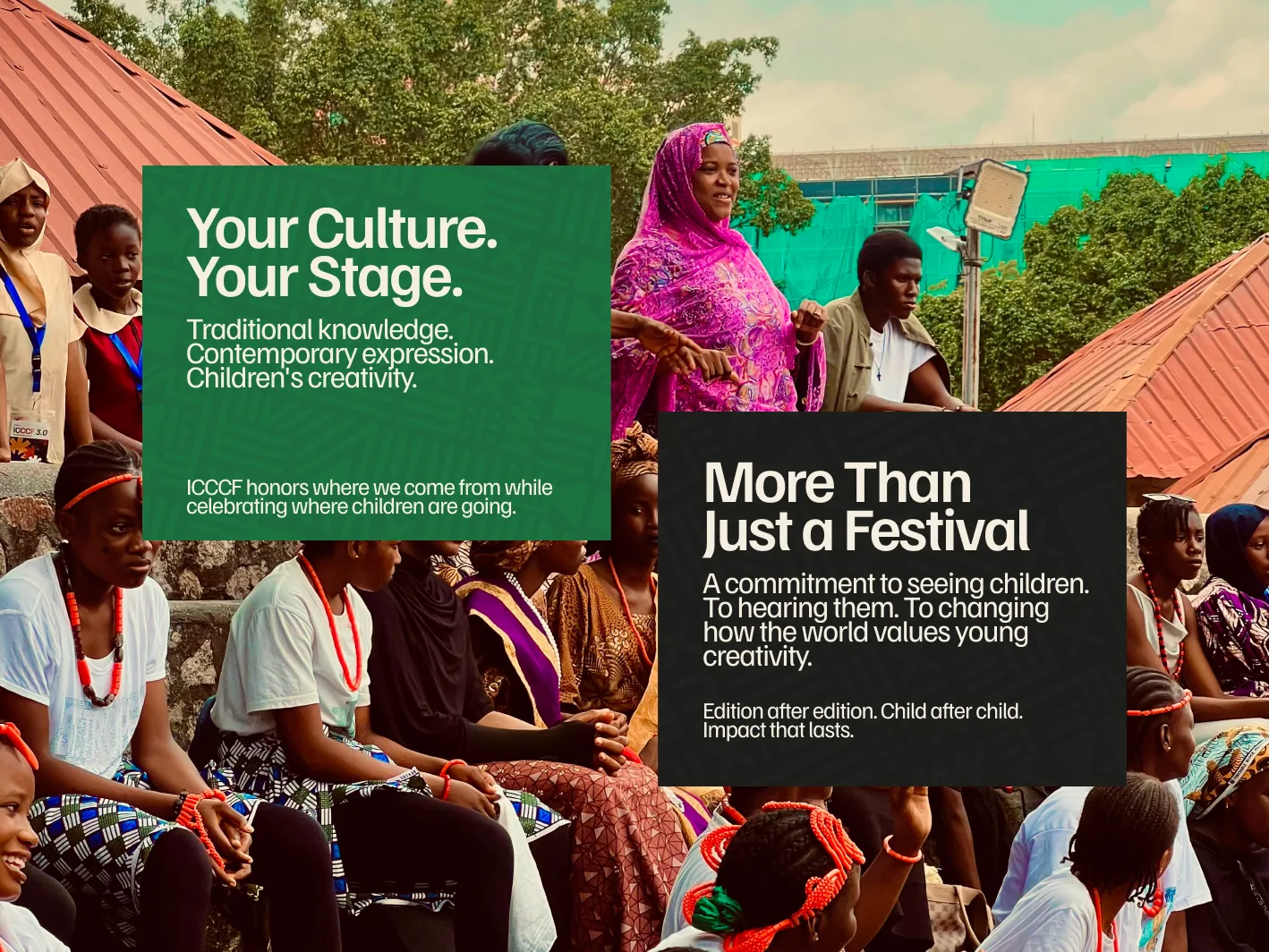
A festival for children can't live on a logo alone. We built a cut-paper pattern in the competition colours, loose and overlapping, the way a child's shapes crowd a page. It climbs the bottom of banners and roll-ups and runs behind the campaign lines. "Show Your Colours." "Plant a Seed Today. Grow Peace Tomorrow." "Your Culture. Your Stage." The festival's mud-cloth motif sits alongside it, which keeps the system rooted in where the festival comes from.
06 · The Grounds
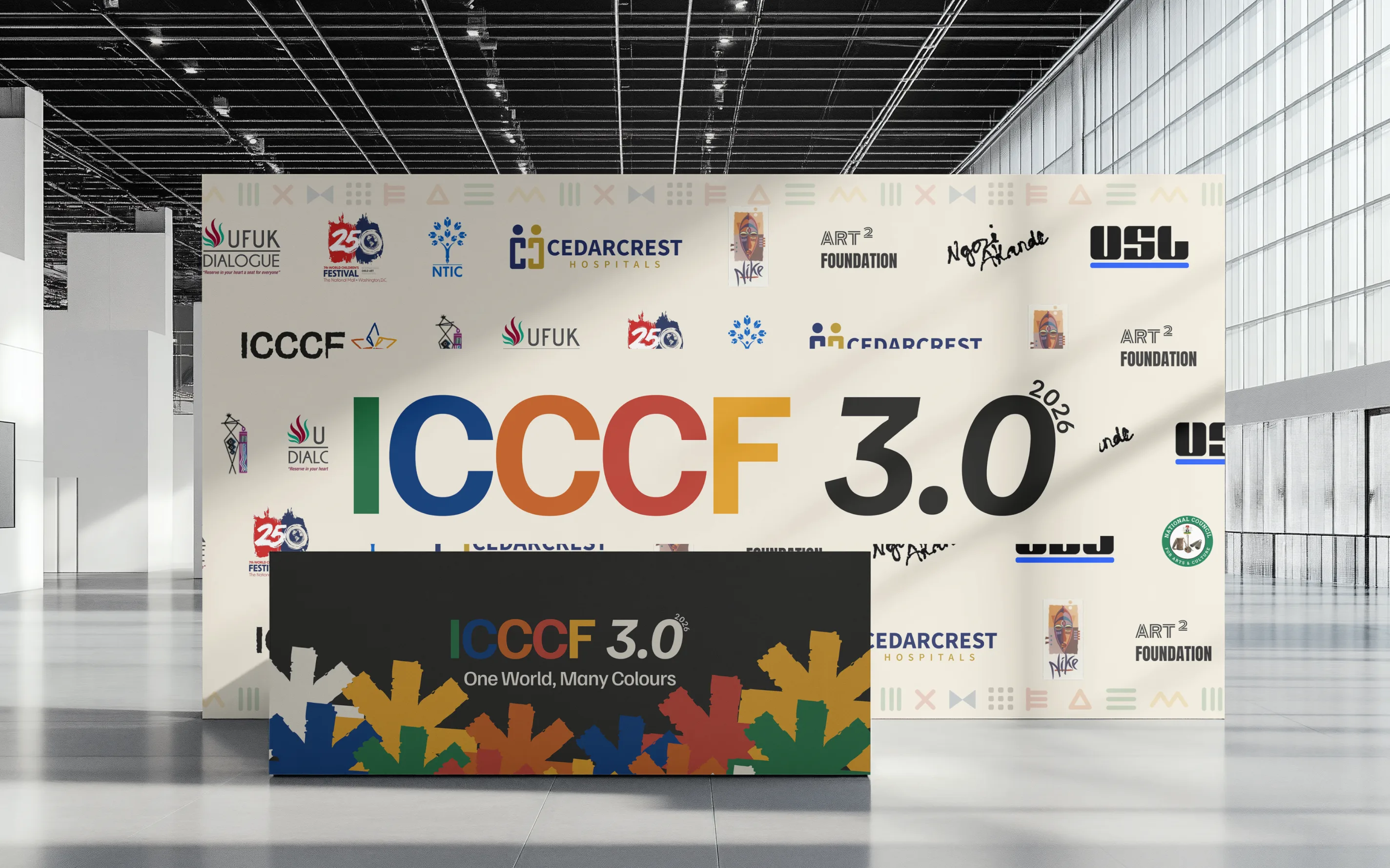
Two venues and three days meant the brand had to work at every distance. We carried the system across the stage backdrop, welcome banners, roll-ups, wayfinding, the three-day schedule, T-shirts, and tags. Ivory frames each piece and the festival colours do the living. The edition number finally has its place here, on the materials made for this festival, while the logo stays ready for the next one.
07 · The Website
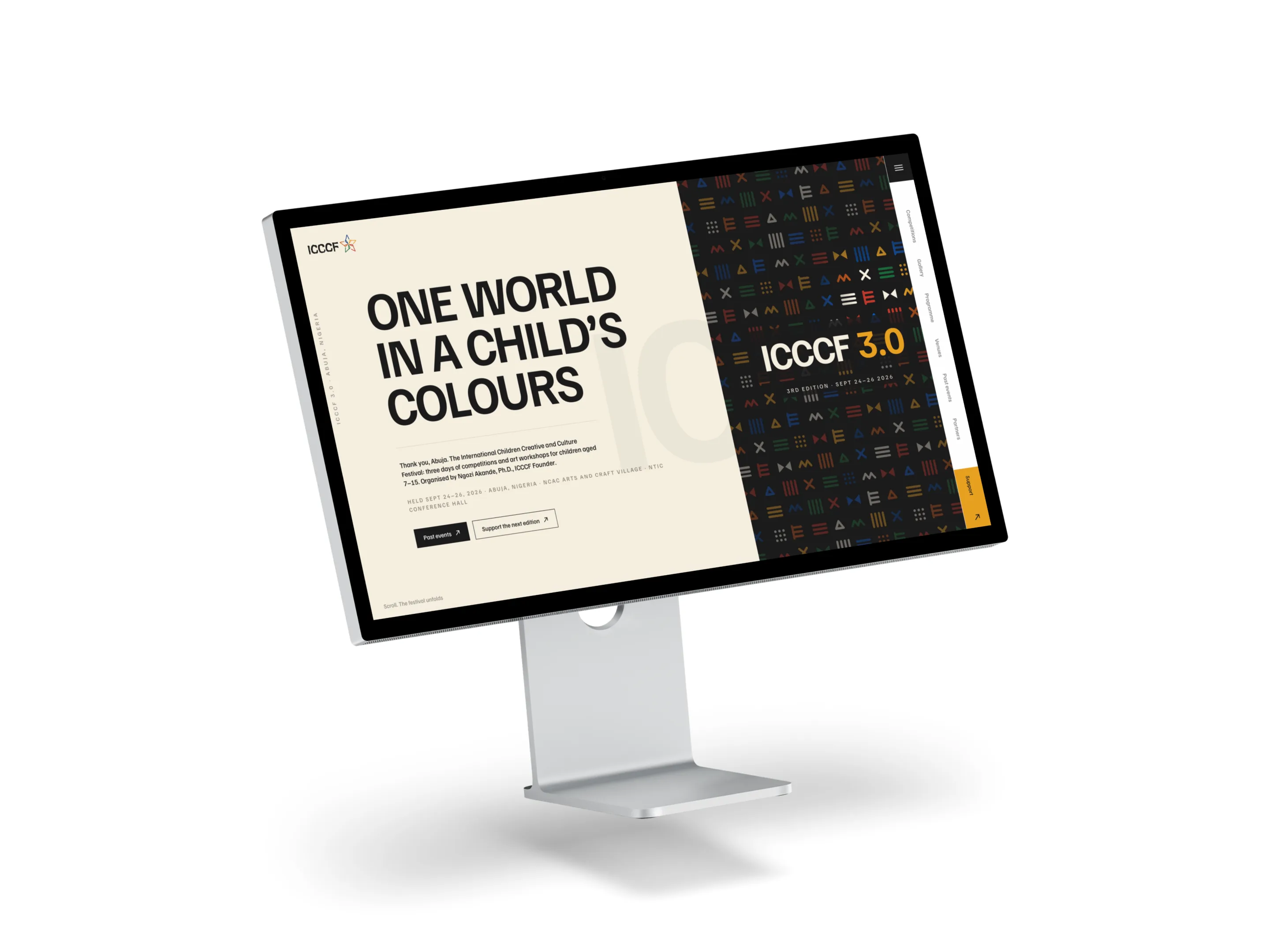
The website had to earn trust from parents, schools, and sponsors long before anyone reached Abuja. It set out the five competitions, the workshops, the venues, the fees, and how entry works, then handed people to the registration forms, the official invitation, and the call for support. Past editions sit alongside, because sixteen years of record is the strongest proof the festival has. When the festival ended, the site changed with it. Registration closed, the countdown gave way to a thank you, and the homepage now reads "Thank you, Abuja."
Delivered:
08 · Impact
Next Project
Found Together